---
title: "1. Southern resident killer whale diets"
subtitle: "Summary statistics across grouped variables"
page-layout: article
author:
- Amy Van Cise
- Sarah Tanja
date: "2026-01-20"
draft: false
date-modified: today
order: 1
format:
html:
toc: true
toc-depth: 2
number-sections: false
code-fold: true
bibliography: "../refs/bib.bibtex"
editor:
markdown:
wrap: 72
---
```{r, setup, include=FALSE}
knitr::opts_chunk$set(
echo = TRUE, # Display code chunks
eval = TRUE, # Evaluate code chunks
warning = FALSE, # Hide warnings
message = FALSE, # Hide messages
comment = "") # Prevents appending '##' to beginning of lines in code output))
```
# Background
Optional background reading:
- [What's for dinner? Scientists unearth key clues to cuisine of
resident killer
whales](https://www.washington.edu/news/2024/09/19/killer-whale-cuisine/)
- [Spatial and seasonal foraging patterns drive diet differences among
north Pacific resident killer whale
populations](https://royalsocietypublishing.org/rsos/article/11/9/rsos240445/92991/Spatial-and-seasonal-foraging-patterns-drive-diet)
@vancise2024
## Guiding research questions
In this lab we will be using simulated data on southern resident killer
whale diet to explore two guiding research questions:
> Q1: Does Chinook salmon make up a majority of the southern resident
> killer whale (SRKW) diet?
> Q2: Does southern resident killer whale (SRKW) diet change throughout
> the year?
::: callout-note
We will **ALL** first work on answering Q1 together in class, and see
how far we get! If you complete Q1, see if you can find someone in class
that has not finished, and try to help them troubleshoot their code!
:::
### Setup your (coding) environment
- Create a *new folder* for *week4* in your R project directory
- Open a *new .Rmd* or *.qmd* file in your *week4* folder
# Q1: Does Chinook salmon make up a majority of the southern resident killer whale (SRKW) diet?
## Step 1. Hypotheses and variables
### Write down your null and alternative hypotheses
- H~o~:
- H~a~:
::: callout-tip
Proper scientific notation for hypotheses uses subscript formatting. You
can use markdown syntax to easily make any text subscript by wrapping
that text in the `~` tilde symbol . For example, `H~o~` when rendered to
markdown or viewed in RStudio visual editor looks like H~o~ .
:::
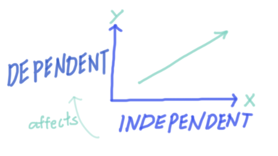
### Identify your x and y variables
- x is the independent, or predictor variable
- y is the dependent, or response variable

::: callout-tip
Think about whether your variables are categorical (factor) or
continuous (numeric). This will help you decide which statistical test
to use later!
:::
### Load libraries
```{r}
library(tidyverse)
library(ggridges) # for making cool ridge plots with ggplot!
```
### Load inputs
- Use the `read_csv()` function from the `readr` package to read in
the simulated killer whale diet data.
::: callout-tip
Remember to adjust the file path as necessary to point to the correct
location of your data file. The file path within the parentheses should
be wrapped in quotes.
`your_data <- read_csv("path/to/your/datafile.csv")`
- Remember to name the data frame something meaningful and short!
- Avoid spaces in your naming conventions! Instead use:
- **Tidyverse (Preferred):** `snake_case` for everything.
- **Base R:** Often uses `period.separated` names.
- **Other:** `camelCase` is also used in some contexts.
- Use the assignment operator `<-` to assign the output of the
`read_csv()` function to your data frame name.
- The hotkey `Alt + -` (or `Option + -` on Mac) can be used to insert
the assignment operator `<-`.
:::
```{r}
#| include: false
kw_diet <- read_csv("../output/KW_diet_simulated_data.csv")
```
## Step 2. Wrangle and visualize the data
```{r, include=FALSE}
# Does chinook make up a majority of the diet?
#1 wrangle data - learn group_by, summarize, and mutate
diet_summary <- kw_diet %>%
group_by(Ind,species) %>%
summarize(meanDiet = mean(propDiet)) %>%
mutate(Chinookyesno = ifelse(species == "Chinook salmon", "yes", "no"))
#2 plot data
ggplot(diet_summary, aes(y = species, x = meanDiet, fill = species)) +
geom_density_ridges()
ggplot(diet_summary, aes(x = Chinookyesno, y = meanDiet, fill = Chinookyesno)) +
geom_boxplot()
#3 statistic
test <- aov(meanDiet~Chinookyesno, data=diet_summary)
summary(test)
diet_summary_all <- kw_diet %>%
group_by(species) %>%
summarize(meanDiet = mean(propDiet))
glimpse(diet_summary_all)
anova_all <- aov(meanDiet~species, data=diet_summary_all)
summary(anova_all)
```
### Identify the variables needed to answer your research question
- Use the `glimpse()` function from the `dplyr` package to view the
structure of your data frame and identify your x and y variables you
will need to answer your research question.
```{r}
glimpse(kw_diet)
```
In this dataframe
- `species` refers to fish species consumed
- `propDiet` refers to the proportion of fish species DNA found in a poop sample
::: callout-tip
- Ask yourself:
- Are my x and y variables present in the data frame?
- If not, what variables do I need to transform to get my x and y variables?
:::
### Wrangle your variables into columns
#### group_by & summarize
This week we are going to learn the functions `group_by()`,
`summarize()` from the `dplyr` package to wrangle our data.
Use the `R` help function `?` to learn more about these functions. For
example, to learn about the `group_by()` function, run `?group_by` in
the console or a code chunk.
`group_by` is commonly followed by `summarize()`. These two functions
work together hand in hand to first group your data frame by a variable
and then compute the same summary statistics for each group.
Go [here](https://posit.cloud/learn/recipes/transform/TransformI) to
gain more insight into what these important functions do.
```{r, include=TRUE, eval=FALSE}
new_dataframe <- your_data %>%
  group_by(col_a, col_b) %>%
  summarize(new_col = mean(col_a),
            new_col2 = sd(col_a))
```
Use `summarize()` to create a new column for each statistic you
explicitly code. `summarize()` is designed to work with functions that
take a vector of values and return a single value. Here are some useful
candidates:
| Function | Returns |
|----------|--------------------------------|
| `mean()` | mean value of a vector |
| `sd()` | standard deviation of a vector |
```{r, include=FALSE}
diet_summary <- kw_diet %>%
group_by(Ind, species) %>%
summarize(meanDiet = mean(propDiet),
sdDiet = sd(propDiet))
glimpse(diet_summary)
```
```{r, include=FALSE}
#mutate & ifelse
#We will also use the mutate() function from the dplyr package to create a new column indicating whether or not Chinook salmon is present in the diet.
diet_chinook <- diet_summary %>%
mutate(chinookyesno = ifelse(species == "Chinook salmon", "yes", "no"))
glimpse(diet_chinook)
```
### Visualize your data
```{r, eval=FALSE, include=TRUE}
ggplot(your_data, aes(x = your_x_variable, y = your_y_variable)) +
  geom_point() +
  theme_minimal()
```
::: callout-tip
Try layering `geom_boxplot(alpha=0.7)` on top of a `geom_point()` layer!
This shows both the individual data points and the boxplot quartiles
summary simultaneously.
:::
```{r include=FALSE}
ggplot(diet_summary,
aes(x = species, y = meanDiet,
fill = species, color = species)) +
geom_point() +
geom_boxplot(alpha = 0.7) +
guides(color = "none", fill = "none") +
labs(x = "Species", y = "Proportion in Diet") +
theme_minimal() +
theme(axis.text.x = element_blank()) # hide species labels
```
```{r, include=FALSE}
ggplot(diet_chinook, aes(x = species, y = meanDiet, color = chinookyesno, fill = chinookyesno)) +
geom_point() +
geom_boxplot(alpha = 0.6) +
labs(x = "Chinook in Diet", y = "Proportion in Diet") +
theme_minimal() +
theme(axis.text = element_text(angle = 45))
```
```{r, include=FALSE}
ggplot(diet_summary, aes(y = species, x = meanDiet, fill = species)) +
geom_density_ridges()+
theme_minimal()
```
## Step 3. Model the relationship
Choose an appropriate model
- Categorical data:
- ANOVA `aov()`
- Follow-up with a Tukey HSD `TukeyHSD()`
- Continuous data:
- linear regression `lm()`
- Is the relationship significant?
- Is the relationship positive or negative?
```{r, include=FALSE}
chinook_anova <- aov(meanDiet ~ species, data = diet_chinook)
summary(chinook_anova)
```
```{r, include=FALSE}
TukeyHSD(chinook_anova)
```
```{r, include=FALSE}
propChinook <- kw_diet %>% filter(species == "Chinook salmon")
chintest <- aov(propDiet ~ season, propChinook)
summary(chintest)
```
```{r, include=FALSE}
chin.lm <- lm(propDiet ~ as.numeric(Month), propChinook)
summary(chin.lm)
```
# Q2: Does southern resident killer whale (SRKW) diet change throughout the year?
```{r, include=FALSE}
# Does diet change throughout the year? AKA does one species change throughout the year?
#1 ggplot with facet wrap
ggplot(kw_diet, aes(x = as.numeric(Month), y = propDiet,
color = species, fill = species)) +
geom_point() +
geom_smooth(span = 0.8, alpha = 0.5, linewidth = 0.5) +
facet_wrap(~species) +
theme_ridges() +
theme(legend.position = "top",
text = element_text(size = 11)) +
labs(x = "Diet proportion", y = "Month") +
guides(color = guide_legend(nrow = 2),
fill = guide_legend(nrow = 2))
#2 filter data to include just one species
propChinook <- kw_diet %>%
filter(species == "Chinook salmon")
#3 test statistic
chintest <- aov(propDiet ~ season, propChinook)
summary(chintest)
chin.lm <- lm(propDiet ~ as.numeric(Month), propChinook)
summary(chin.lm)
```
## Step 1. Hypotheses and variables
### Write down your null and alternative hypotheses
- H~o~:
- H~a~:
### Identify your x and y variables
- x is the independent, or predictor variable
- y is the dependent, or response variable
## Step 2. Wrangle and visualize the data
```{r, include=FALSE}
ggplot(kw_diet, aes(x = as.numeric(Month), y = propDiet, color = species, fill = species)) +
geom_point() +
geom_smooth(span = 0.8, alpha = 0.5, linewidth = 0.5) +
facet_wrap(~species) +
theme_ridges() +
theme(legend.position = "top", text = element_text(size = 11)) +
labs(x = "Month", y = "Diet Proportion") +
guides(color = guide_legend(nrow = 2),
fill = guide_legend(nrow = 2))
```
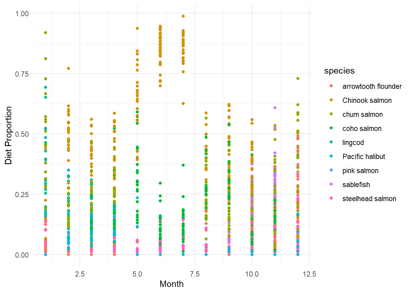
```{r}
ggplot(kw_diet,
       aes(x = Month, y = propDiet,
           color = species, fill = species)) +
       geom_point()+
       labs(x = "Month", y = "Diet Proportion") +
       theme_minimal()
```
This data is pretty messy when viewed all together! Let's pickout one species to focus on using `filter()` from the `dplyr` package.
`filter()` allows us to subset our data frame based on specific criteria. For example, we can filter the `species` column to only include rows where the species is `["pick your favorite fish"]`.
```{r, include=TRUE, eval=FALSE}
new_dataframe <- your_data %>%
  filter(col_a == "some_value")
```
```{r, include=FALSE}
prop_chinook <- kw_diet %>%
filter(species == "Chinook salmon")
glimpse(prop_chinook)
```
```{r, include=FALSE}
ggplot(prop_chinook,
aes(x = as.numeric(Month), y = propDiet)) +
geom_point() +
geom_smooth(span = 0.8, alpha = 0.5, linewidth = 0.5) +
labs(x = "Month", y = "Proportion of Chinook in Diet") +
theme_minimal()
```
::: callout-note
- Try layering `geom_smooth()` on top of a `geom_point()` layer!
This shows both the individual data points and the trend
simultaneously.
:::
## Step 3. Model the relationship
Does the proportion of `[insert your fish here]` in the diet change throughout the year?
Choose an appropriate model
- Categorical data:
- ANOVA `aov()`
- Follow-up with a Tukey HSD `TukeyHSD()`
- Continuous data:
- linear regression `lm()`
- Is the relationship significant?
- Is the relationship positive or negative?
```{r, include=FALSE}
chin.lm <- lm(propDiet ~ as.numeric(Month), prop_chinook)
summary(chin.lm)
```
## Bonus - facet_wrap()
::: callout-tip
After looking at one fish species, can you look at them all together? Try using `facet_wrap()` to create a panel of plots, one for each species!
:::
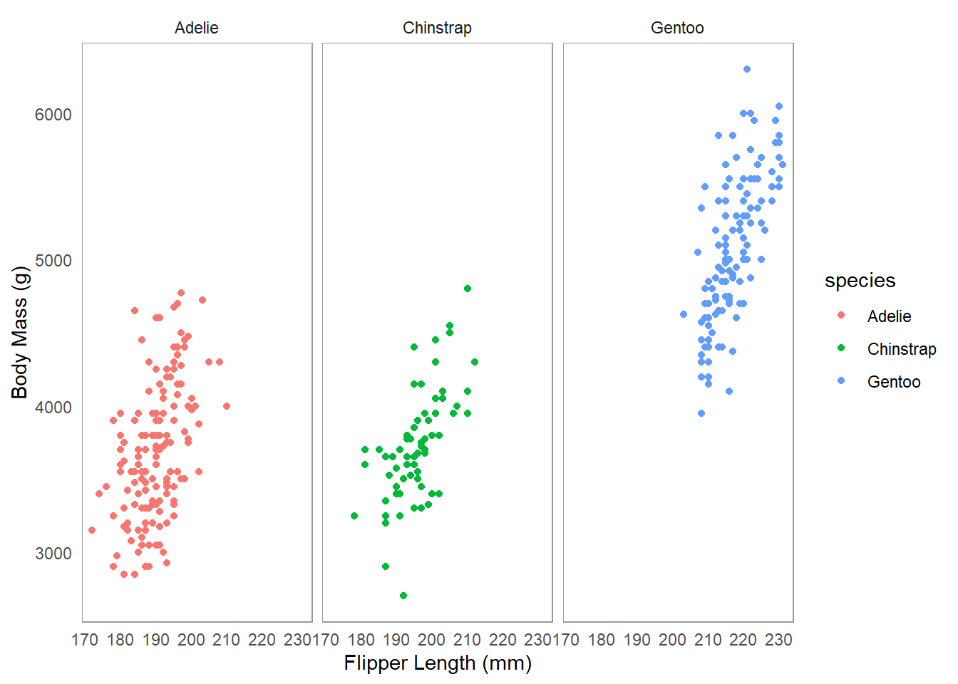
An example dataset `palmerpenguins` is available in the `palmerpenguins` package. Here is an example of how to use `facet_wrap()` with this dataset to create separate plots for each species of penguin.
```{r}
library(palmerpenguins)
ggplot(penguins, aes(x = flipper_length_mm, y = body_mass_g,
                     color = species)) +
  geom_point() +
  facet_wrap(~species) +
  labs(x = "Flipper Length (mm)", y = "Body Mass (g)")+
  theme_minimal()+
  theme(panel.grid.major = element_blank(),
        panel.grid.minor = element_blank(),
        panel.border = element_rect(color = "grey60",
                                    fill = NA,
                                    linewidth = 0.4))
```
```{r, include=FALSE}
ggplot(kw_diet,
aes(x = Month, y = propDiet,
color = species, fill = species)) +
geom_point()+
geom_smooth(span = 0.8, alpha = 0.5, linewidth = 0.5) +
facet_wrap(~species) +
labs(x = "Month", y = "Diet Proportion") +
theme_minimal()
```